


Via Ravioli
BRAND IDENTITY, PACKAGING DESIGN
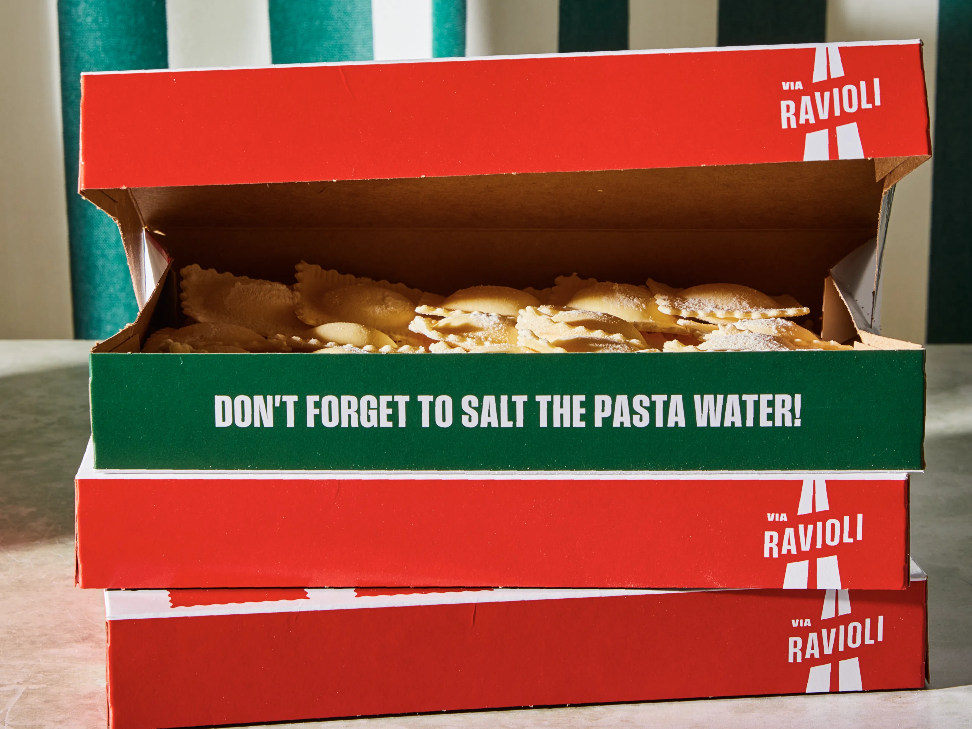
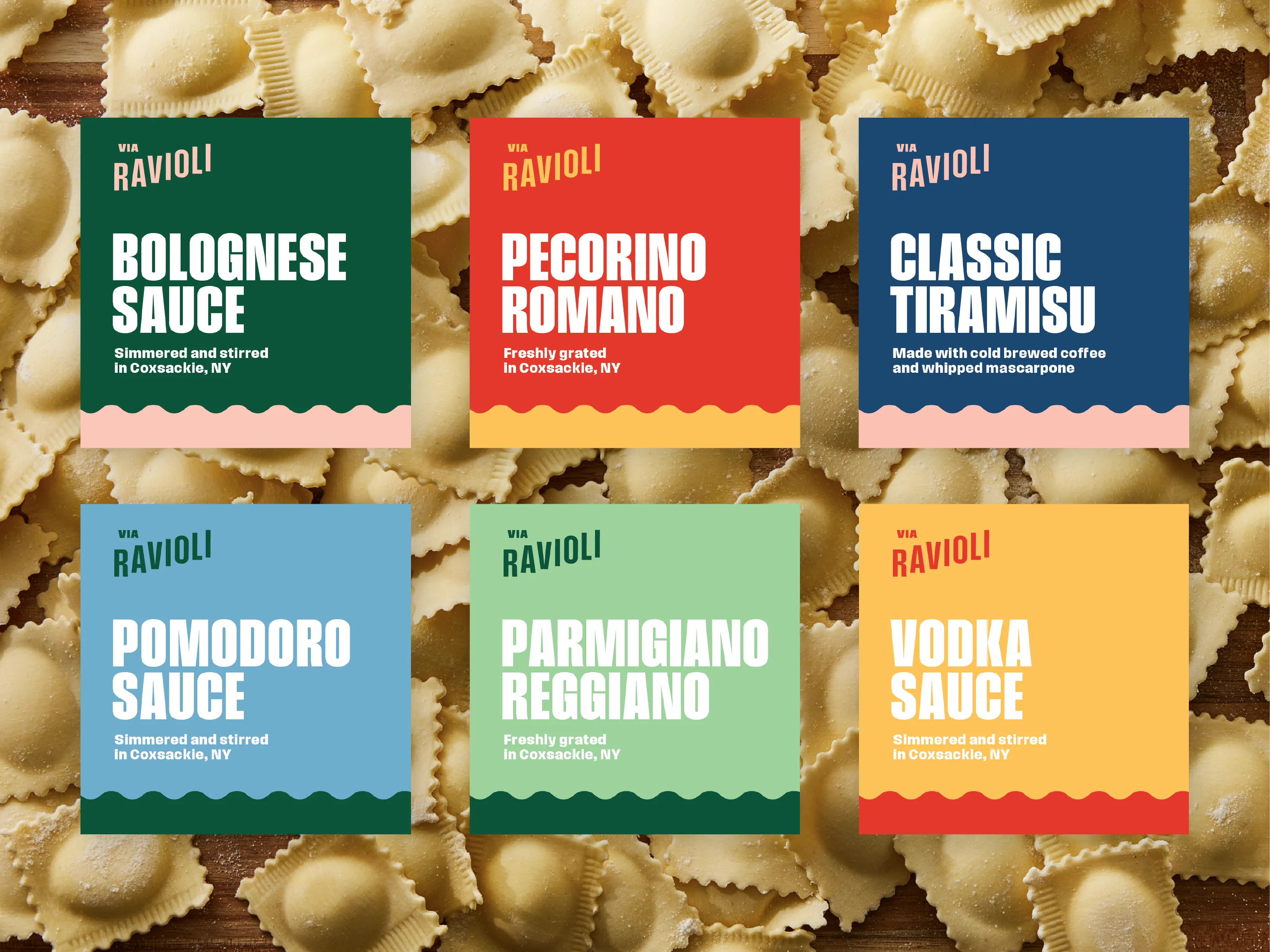
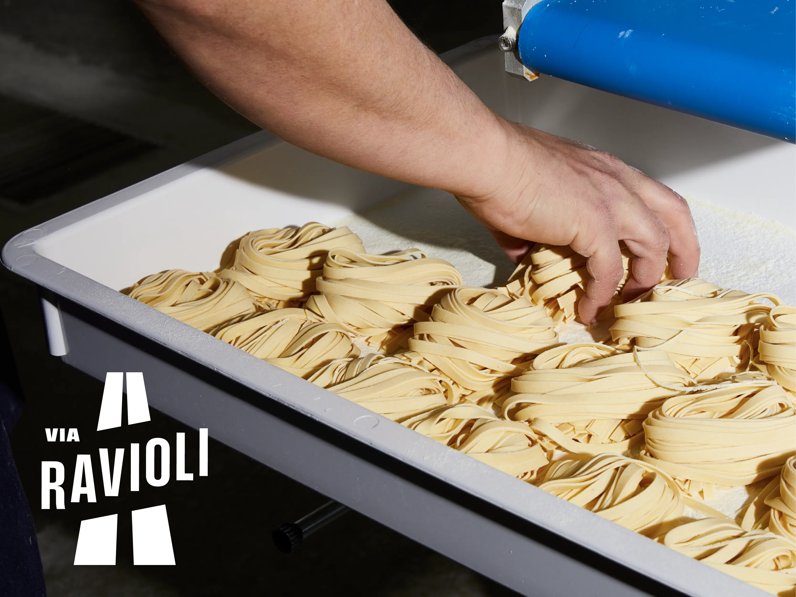
Via Ravioli came in with a plan: a storefront of their own, regional retail placements, and a farmers market presence worth the trip. Today, they’re a staple in all three.
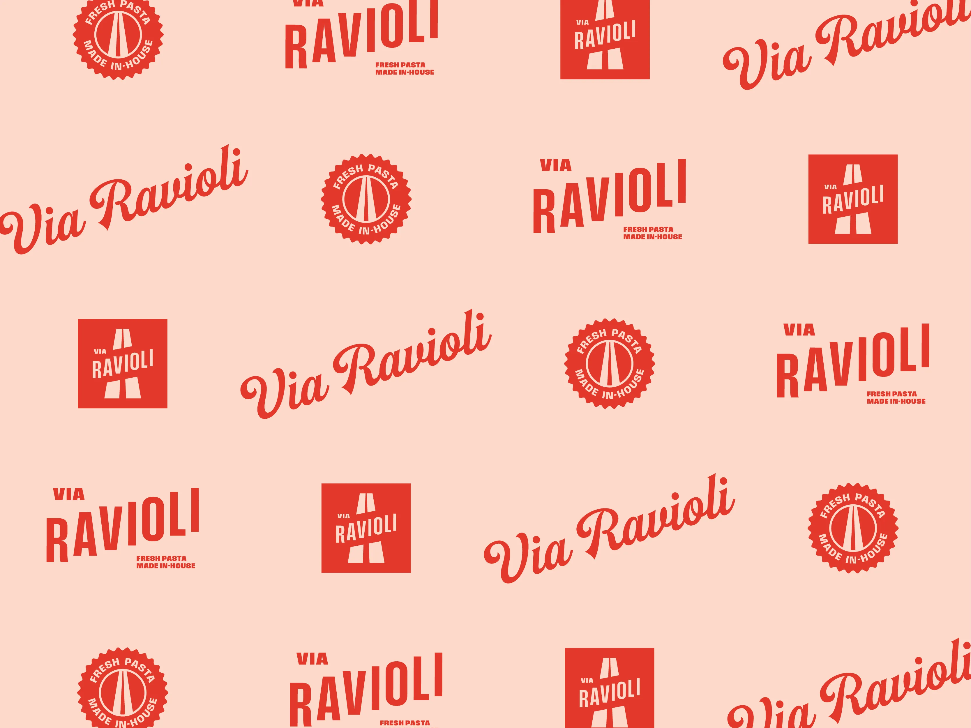
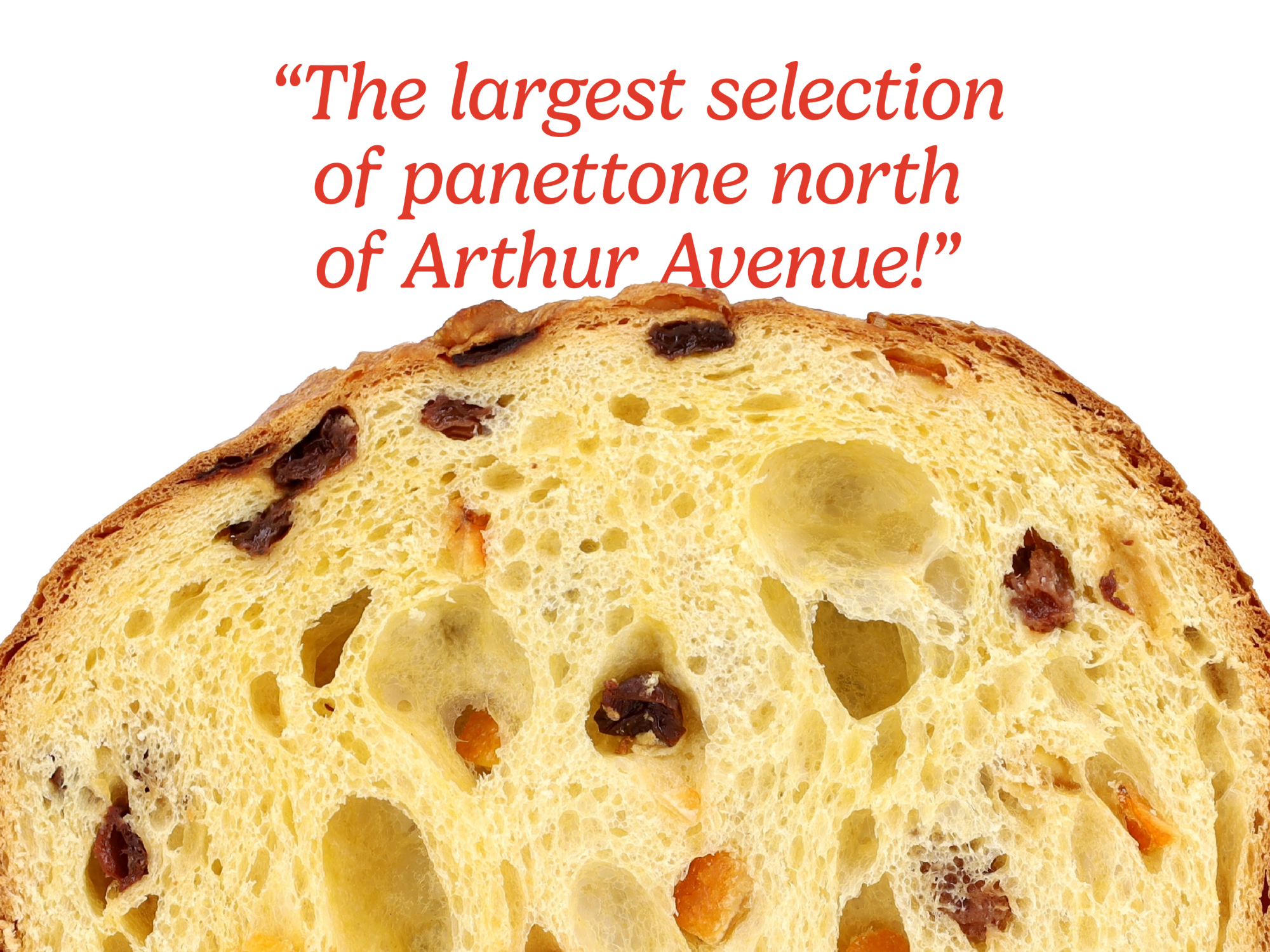
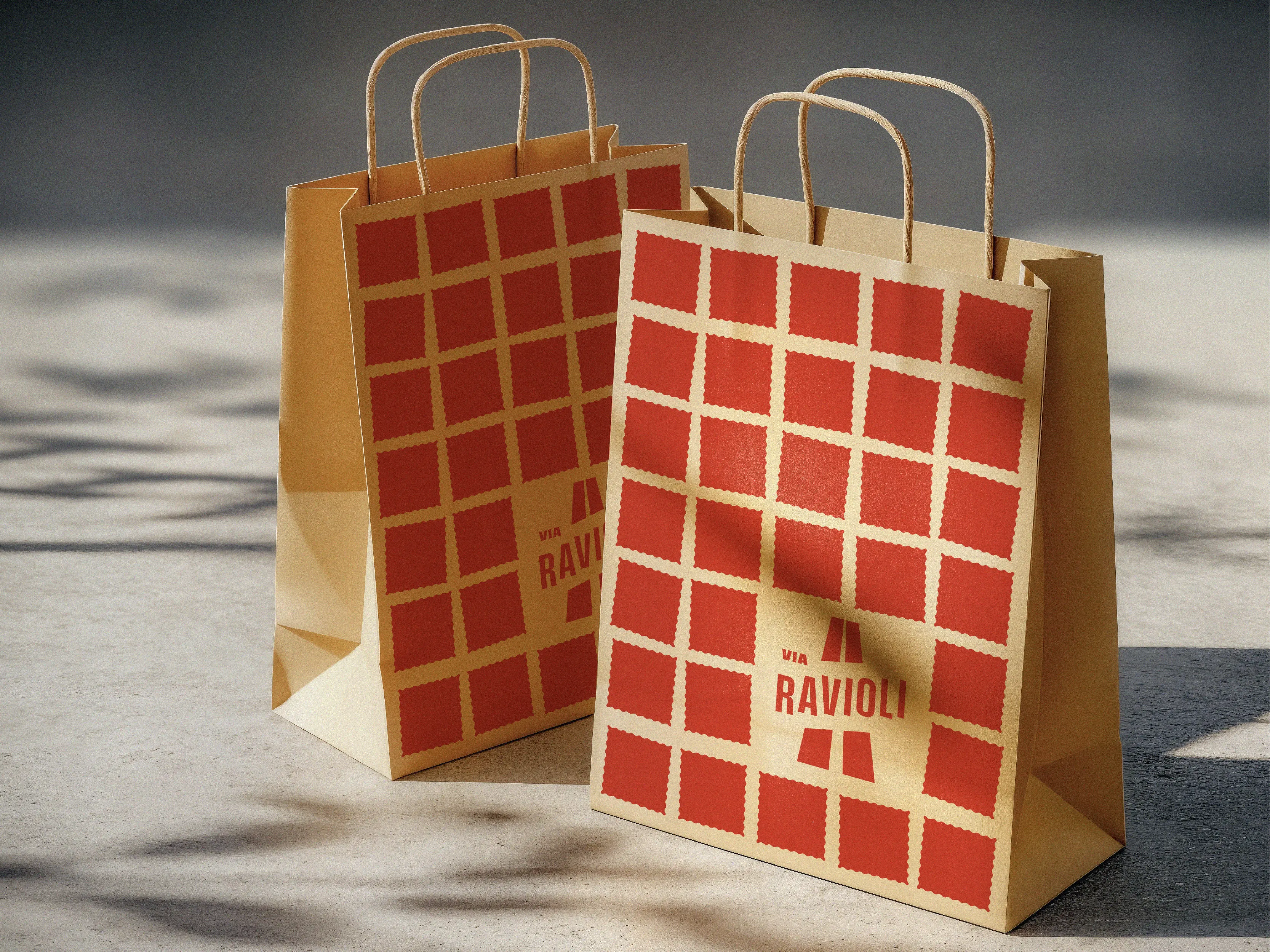
The identity and packaging give Via one recognizable presence across storefront, market, and shelf—with a cheeky nod to Arthur Avenue.


Stiller & Co
PACKAGING
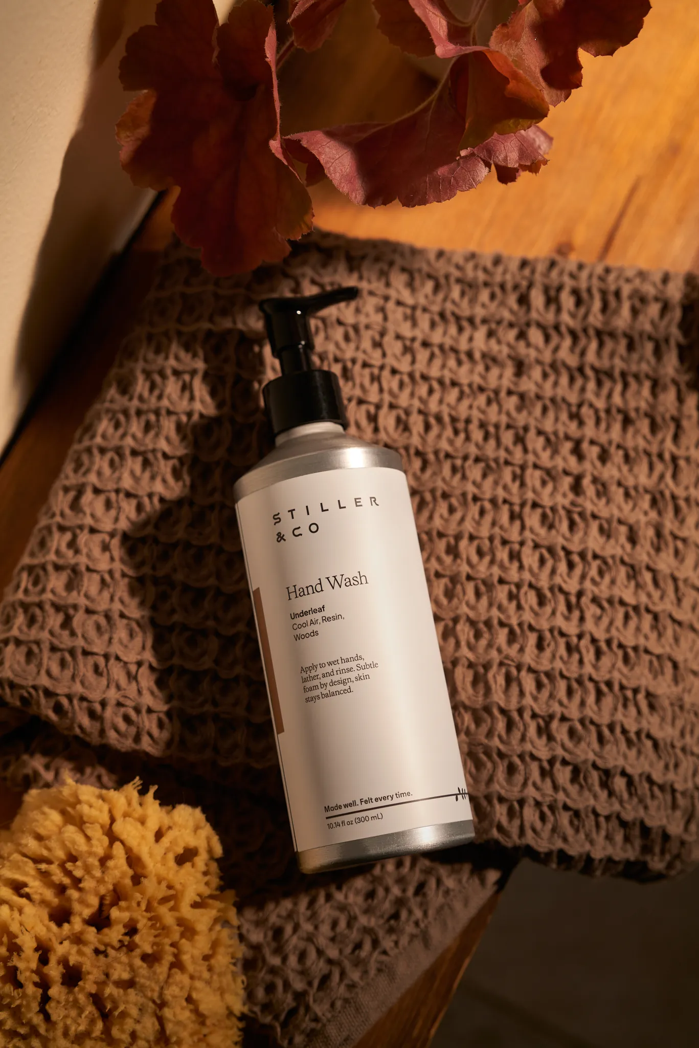
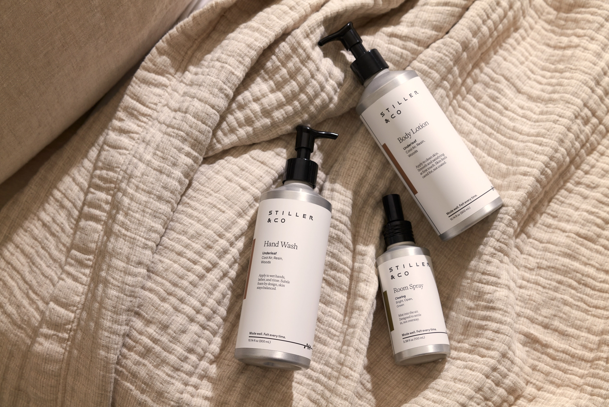
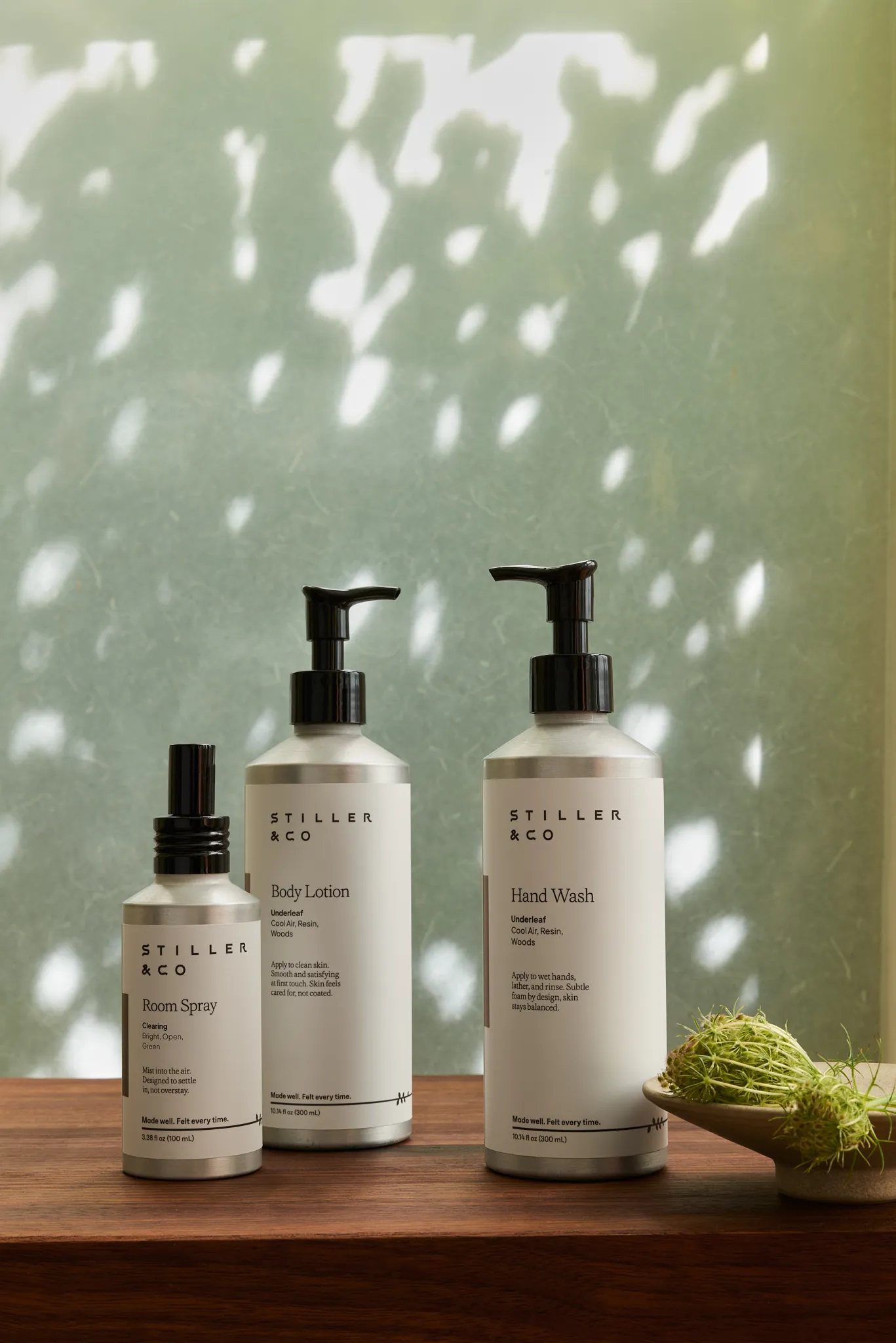
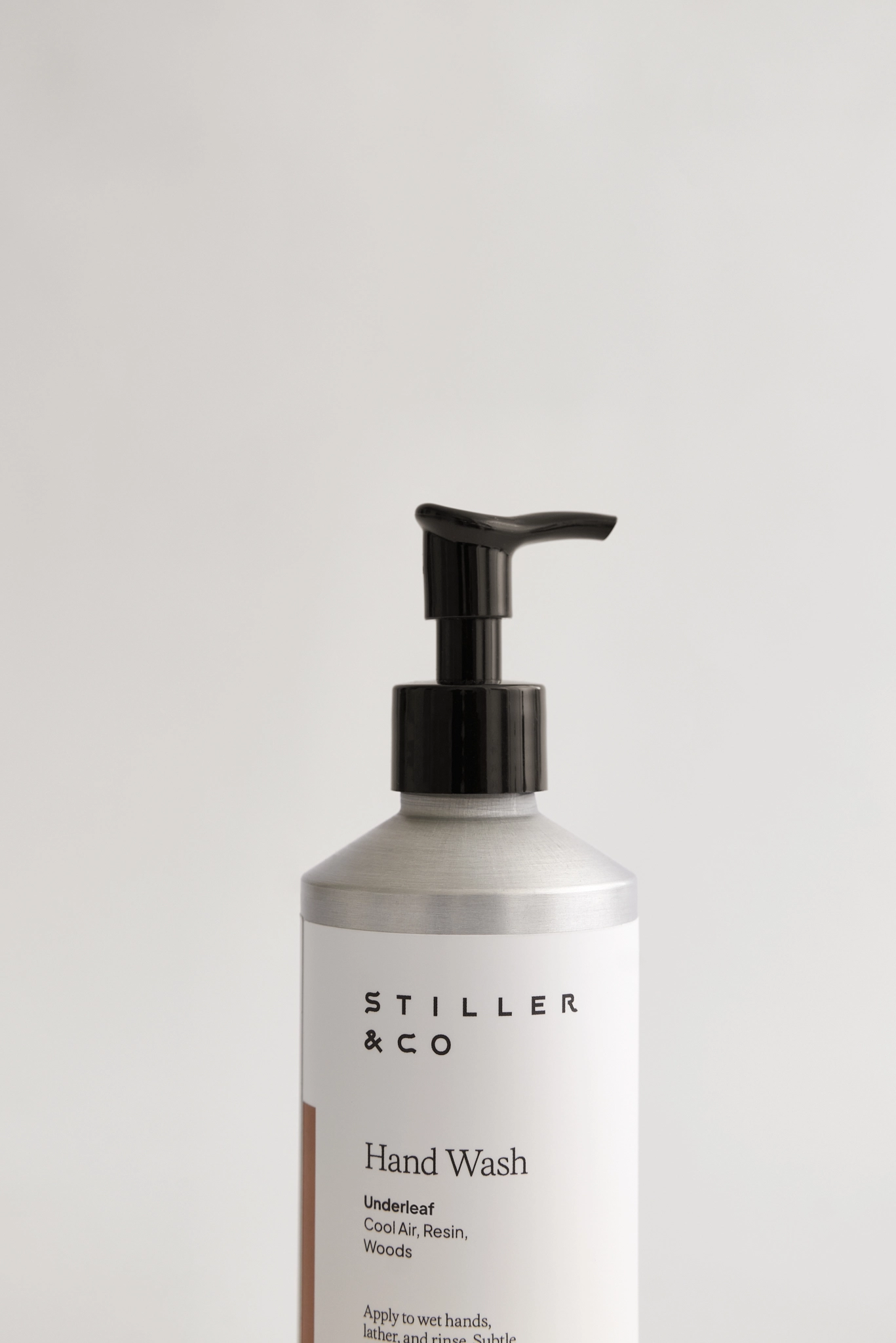
Stiller & Co's brand philosophy is simple: Good things don't need to make big promises. They need to work well, feel good, and earn their place in the everyday.
We brought that same thinking to the packaging: a clean, considered design system with a clear hierarchy. Everything you need to know, and nothing you don't.



Letterbox Farm Bone Broth
BRAND STRATEGY, PACKAGING
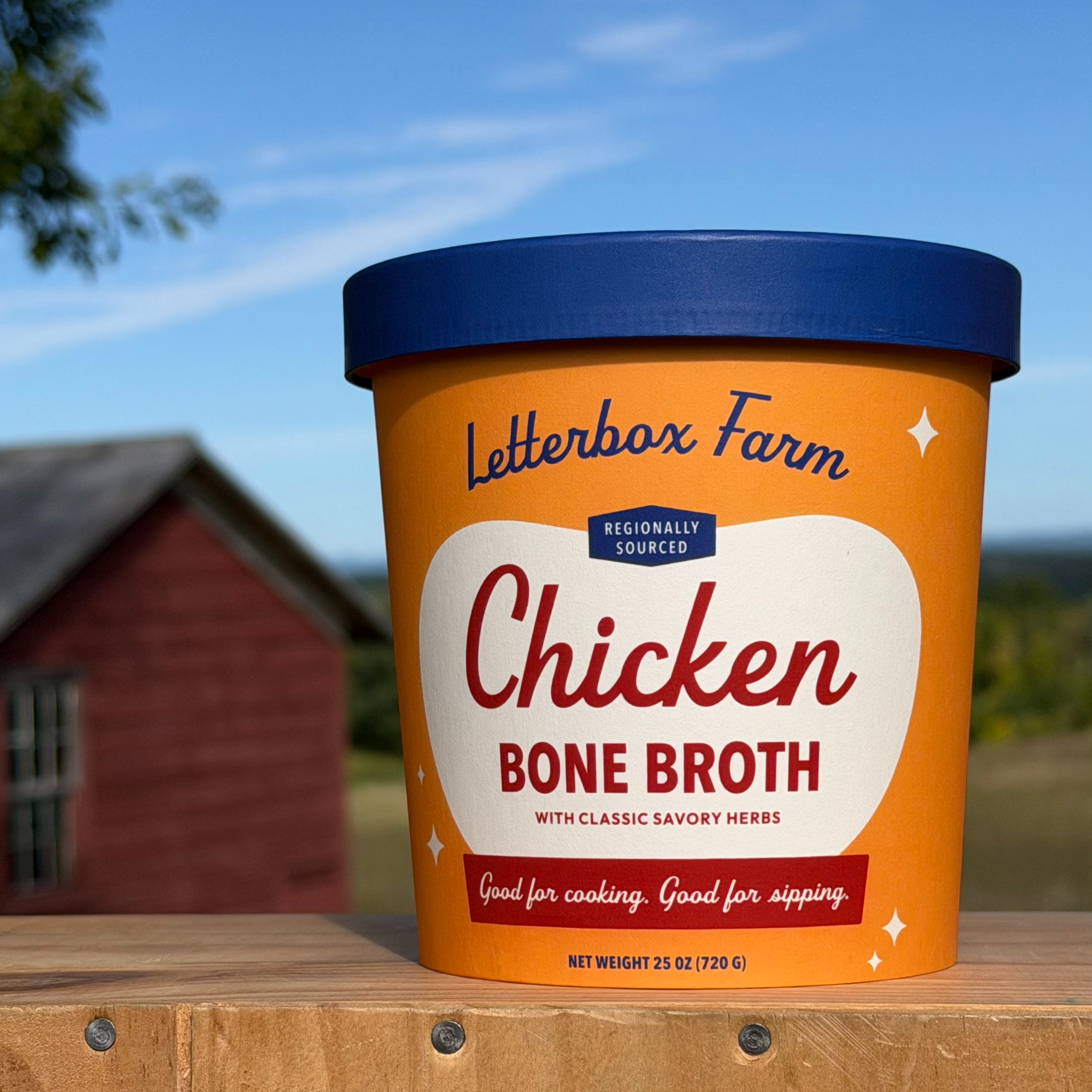
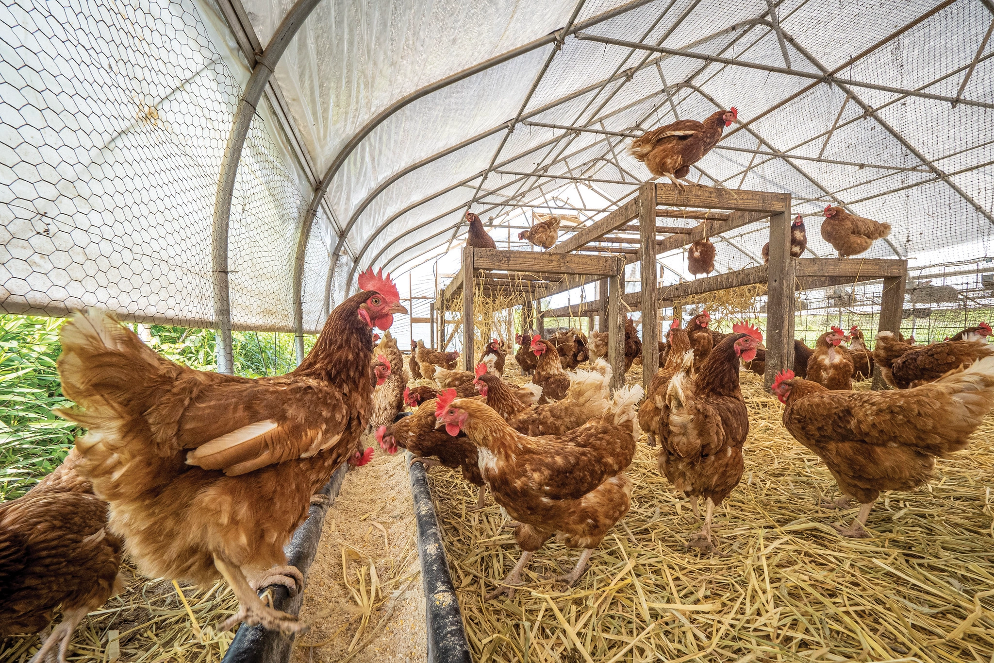
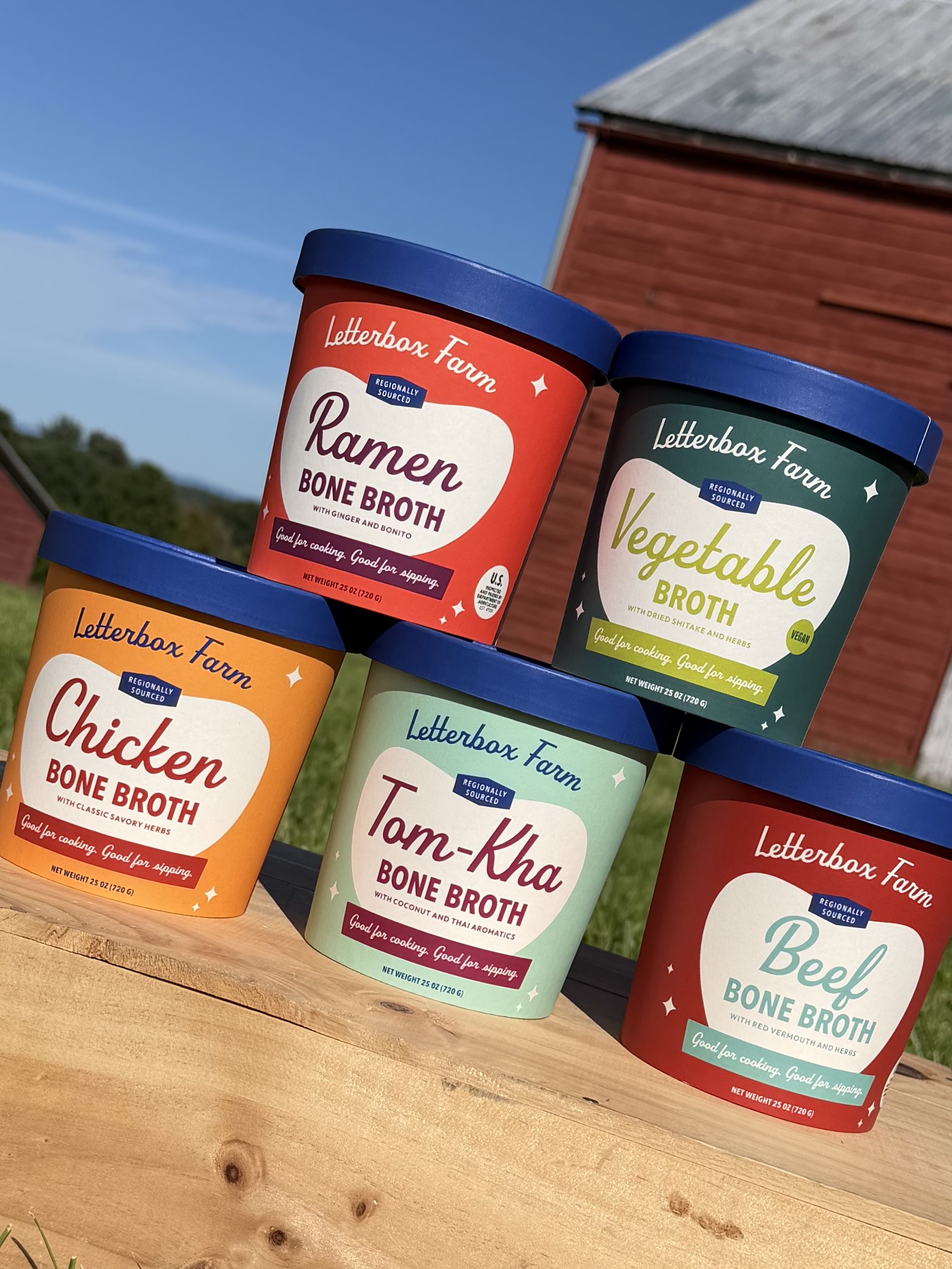
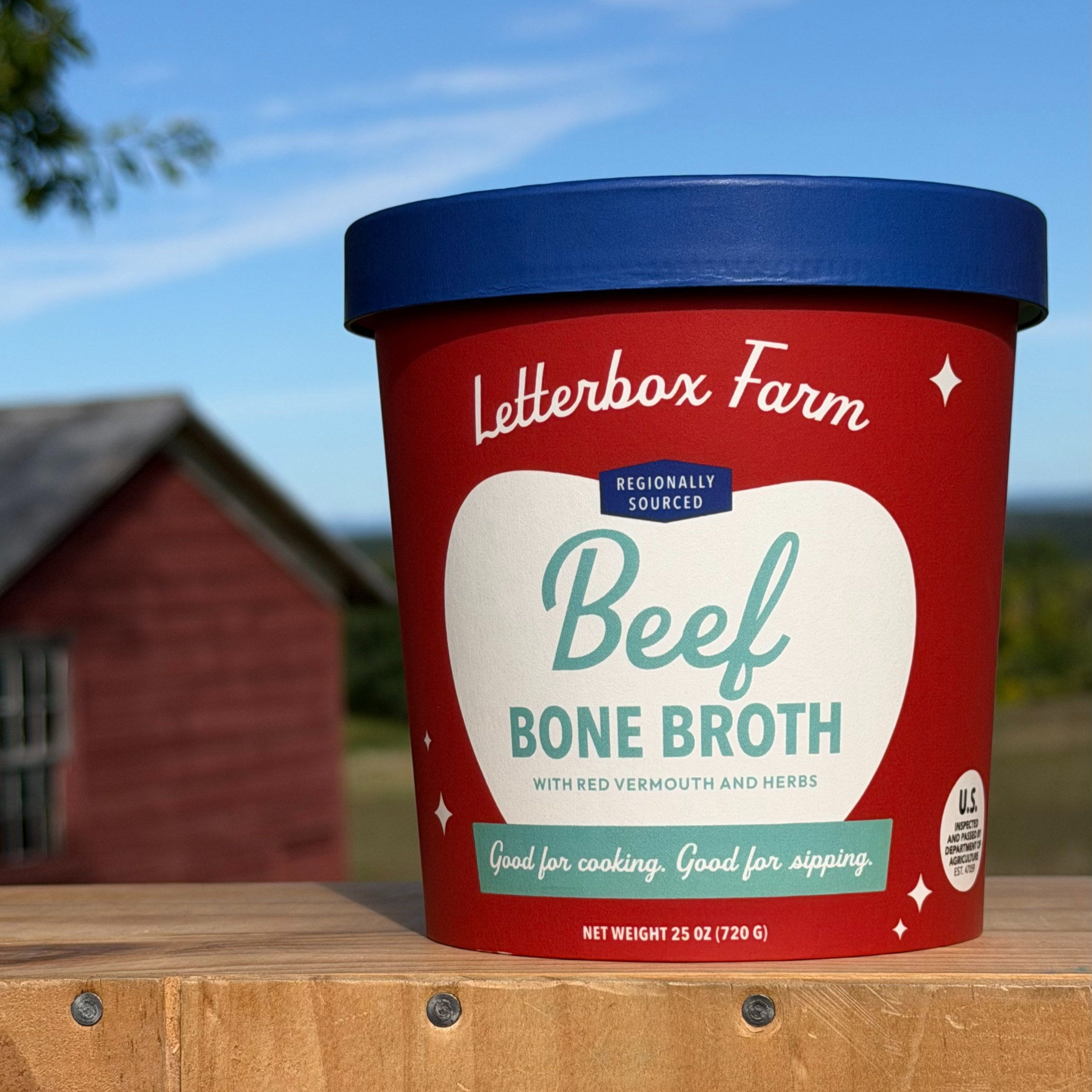
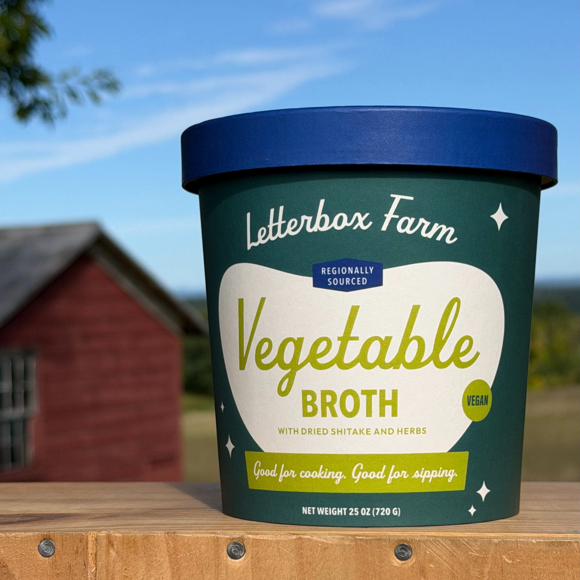
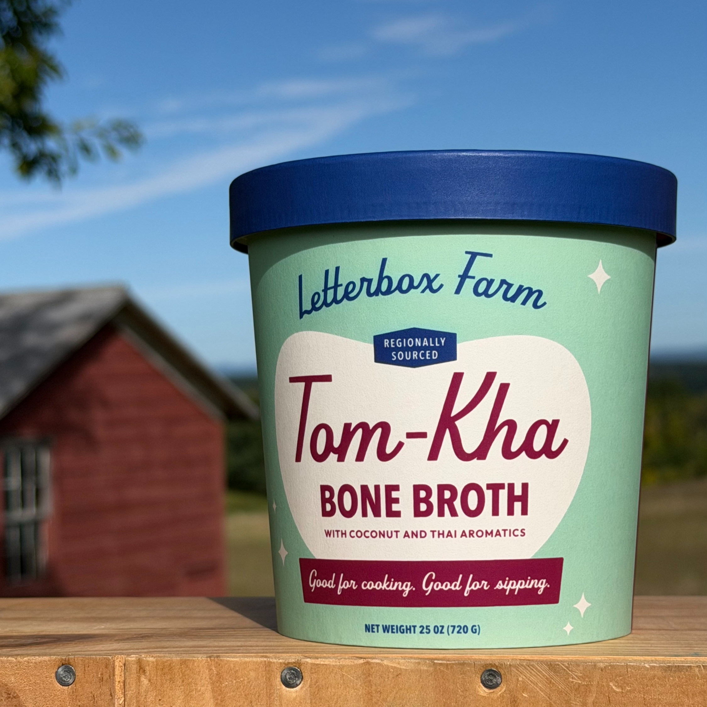
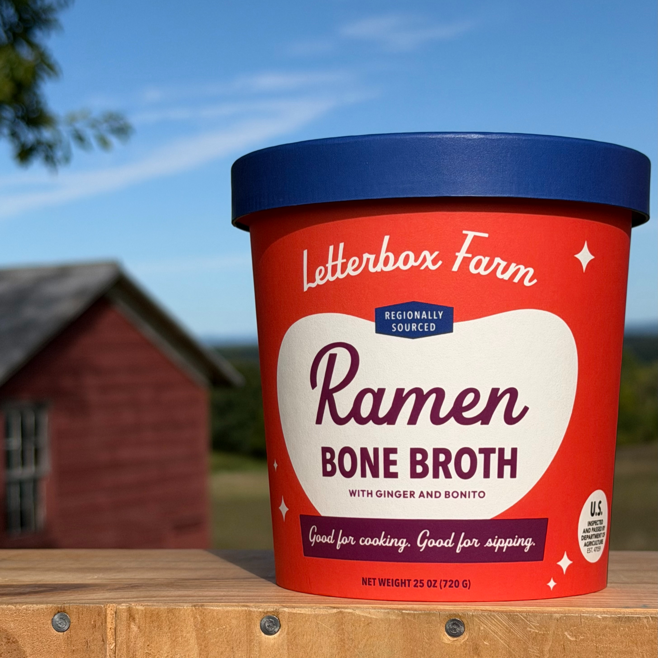
After more than a decade in business, Letterbox Farm came to Breadwinner to position its established line of bone broths for growth across the Northeast. We started with strategy—clarifying what the farm stands for, what makes the product distinct, and what needed to carry forward as the line scaled.
For the packaging, the creative brief was equally clear: No dusty old farm, no sustainability sermon. It needed to feel fresh, generous, and above all, joyful.


Kinrove
BRAND STRATEGY, IDENTITY, PACKAGING
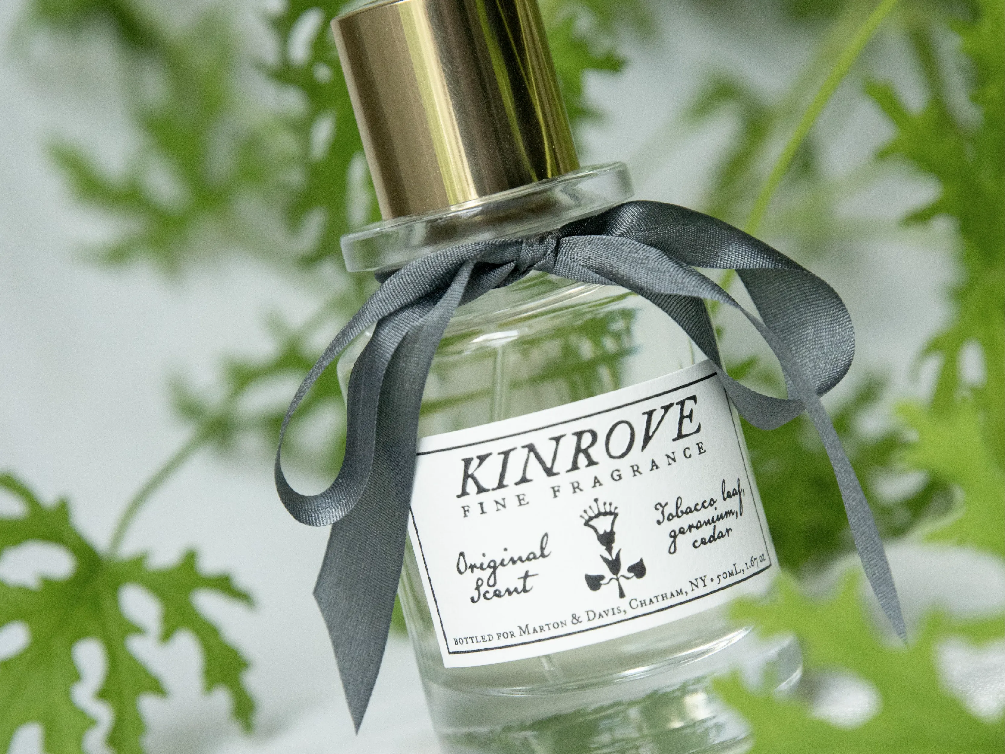
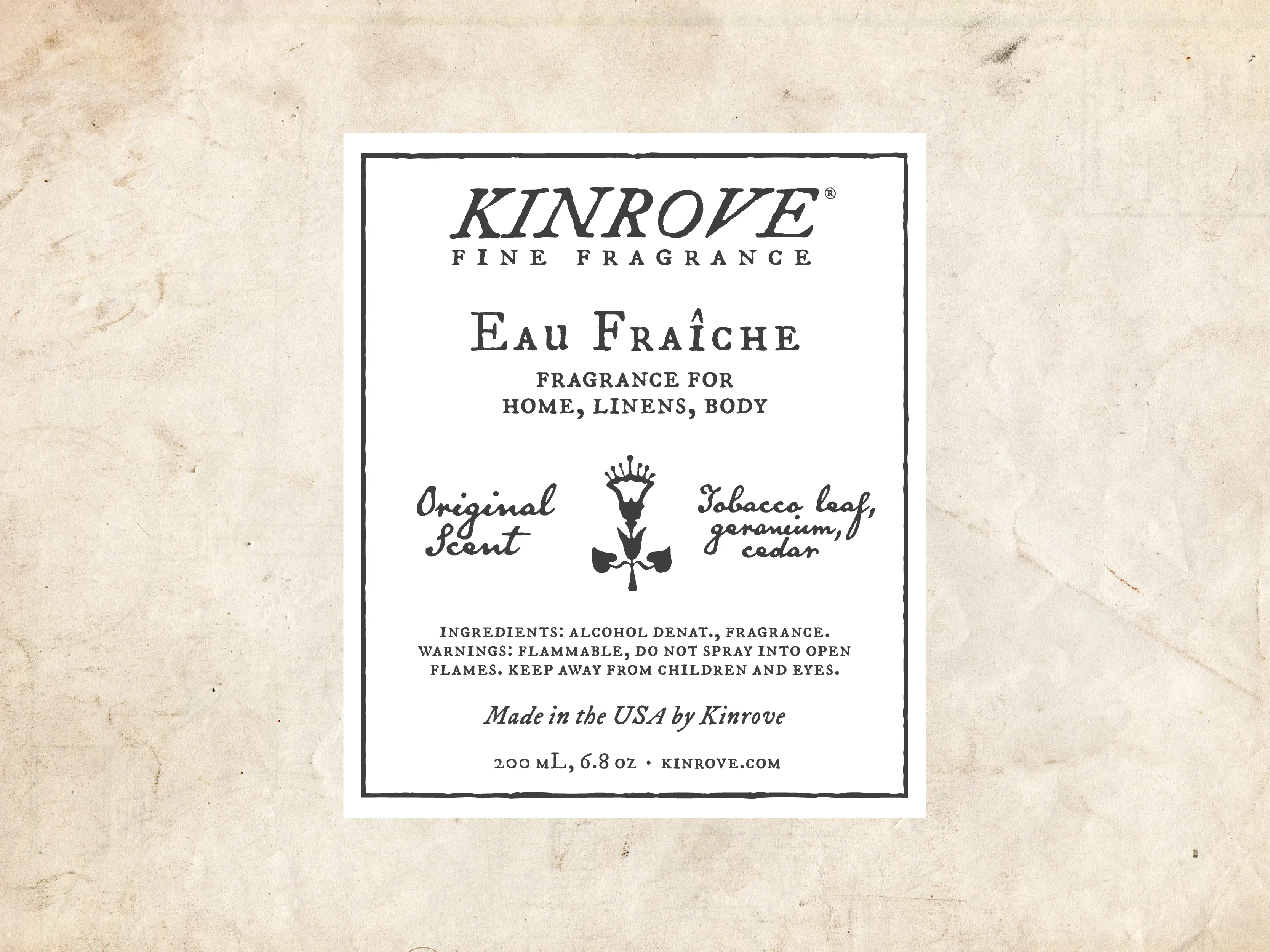
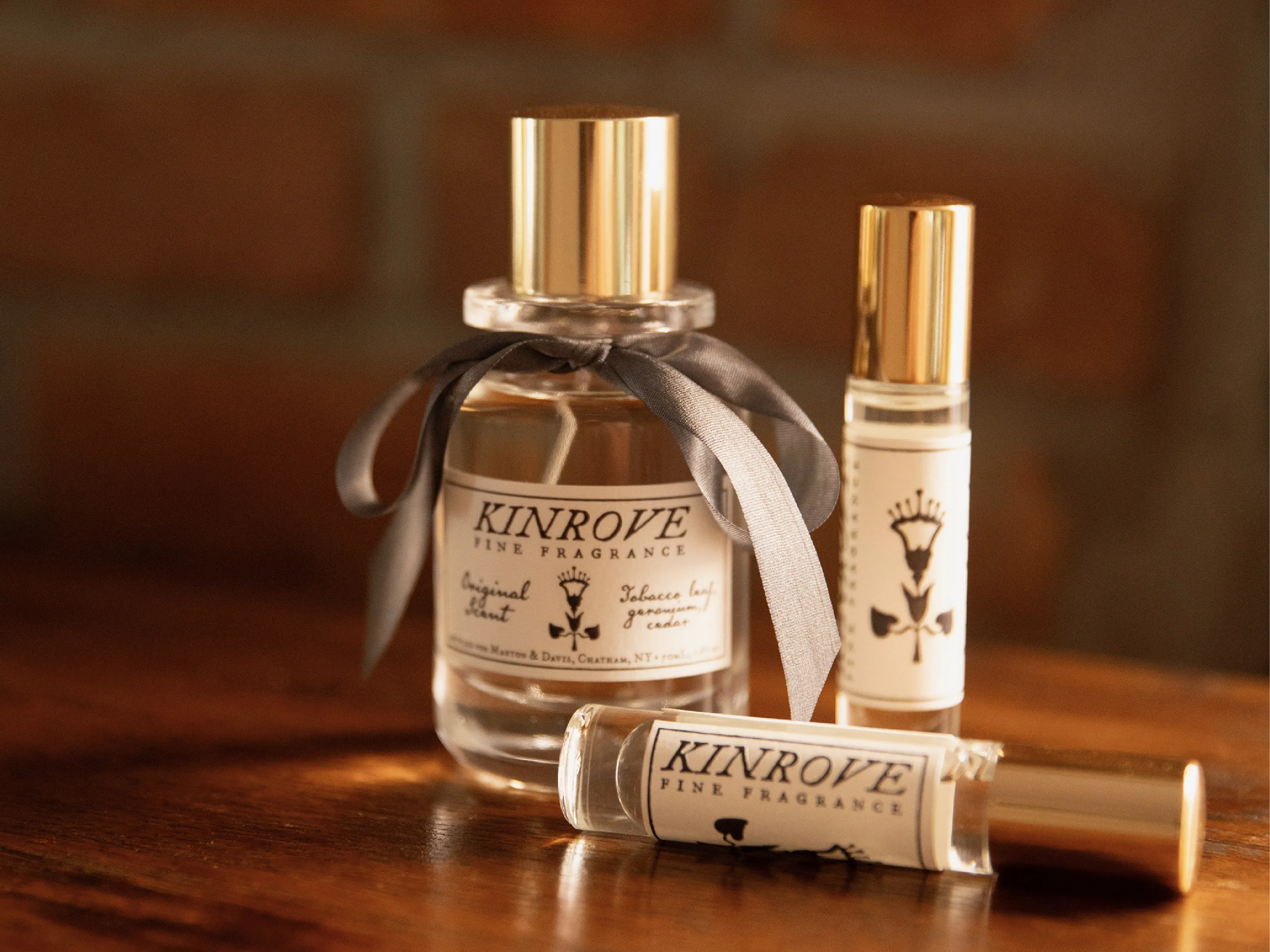
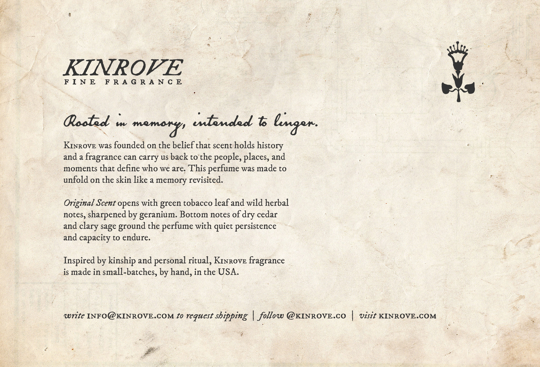
Kinrove entered the market as an independent fine fragrance with one ambition: hold its own on shelves curated with the very best.
It launched as an exclusive at Marton & Davis, one of Architectural Digest's best home decor stores in America (2025), where it became an instant bestseller.


Hemlock
BRAND IDENTITY
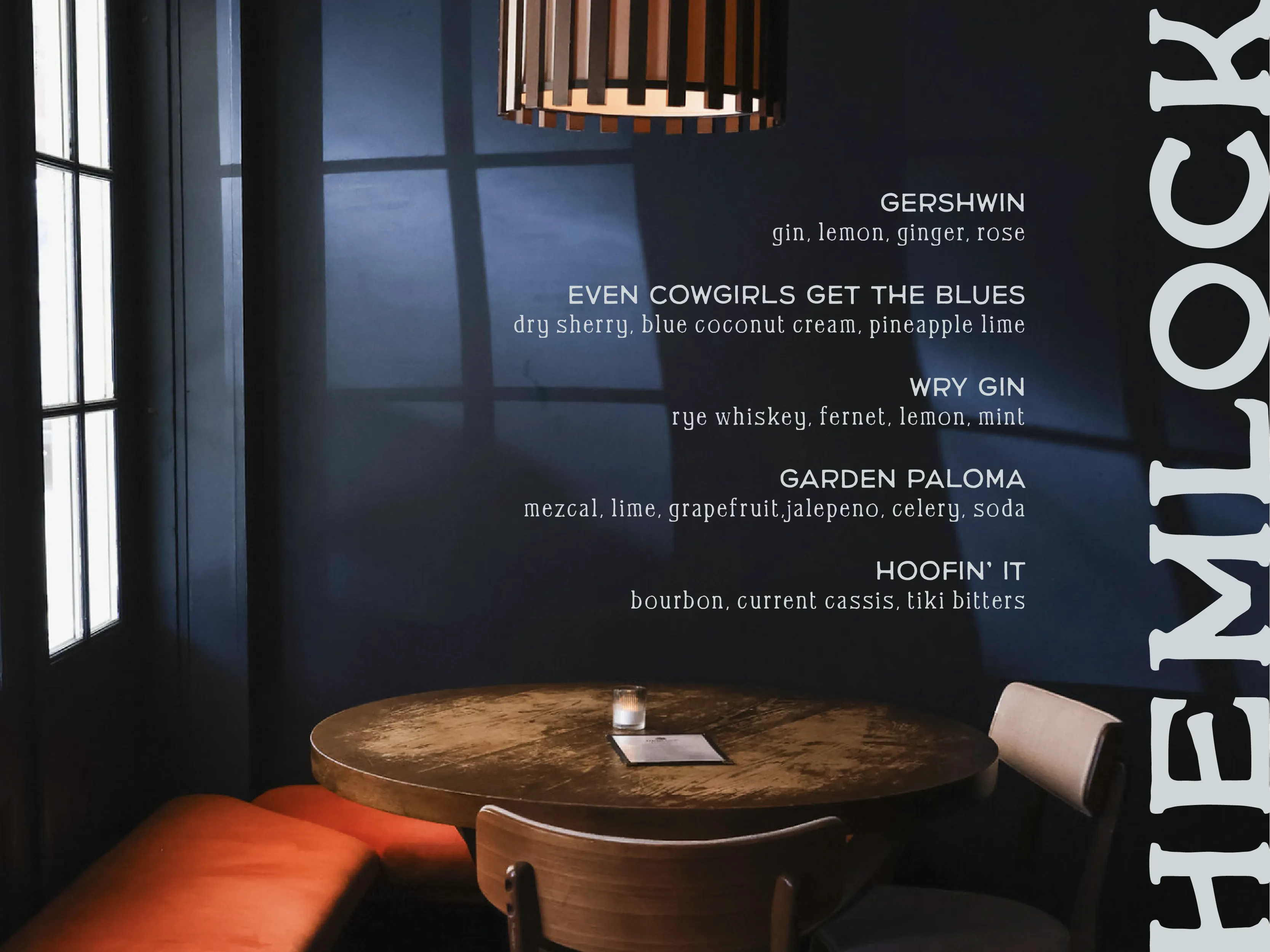
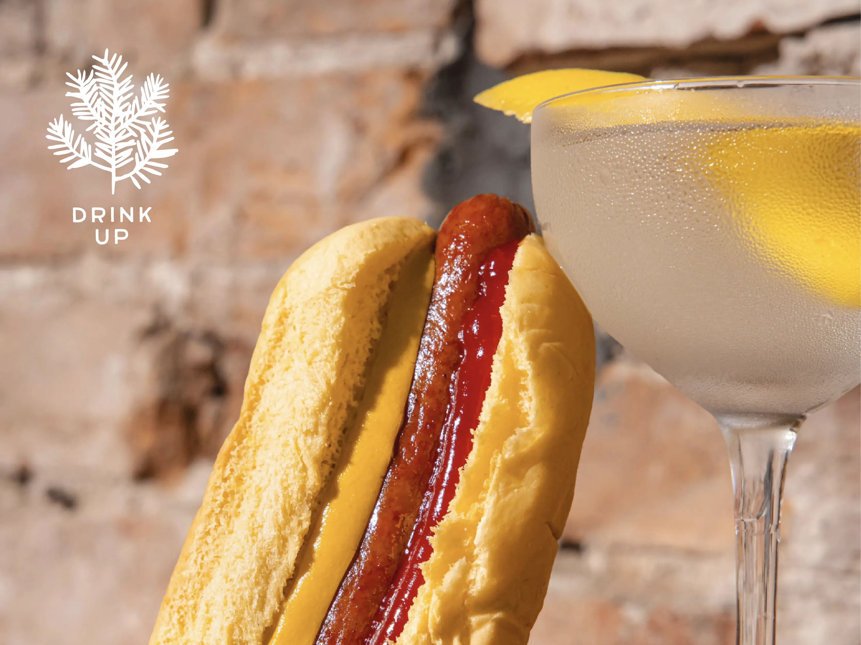
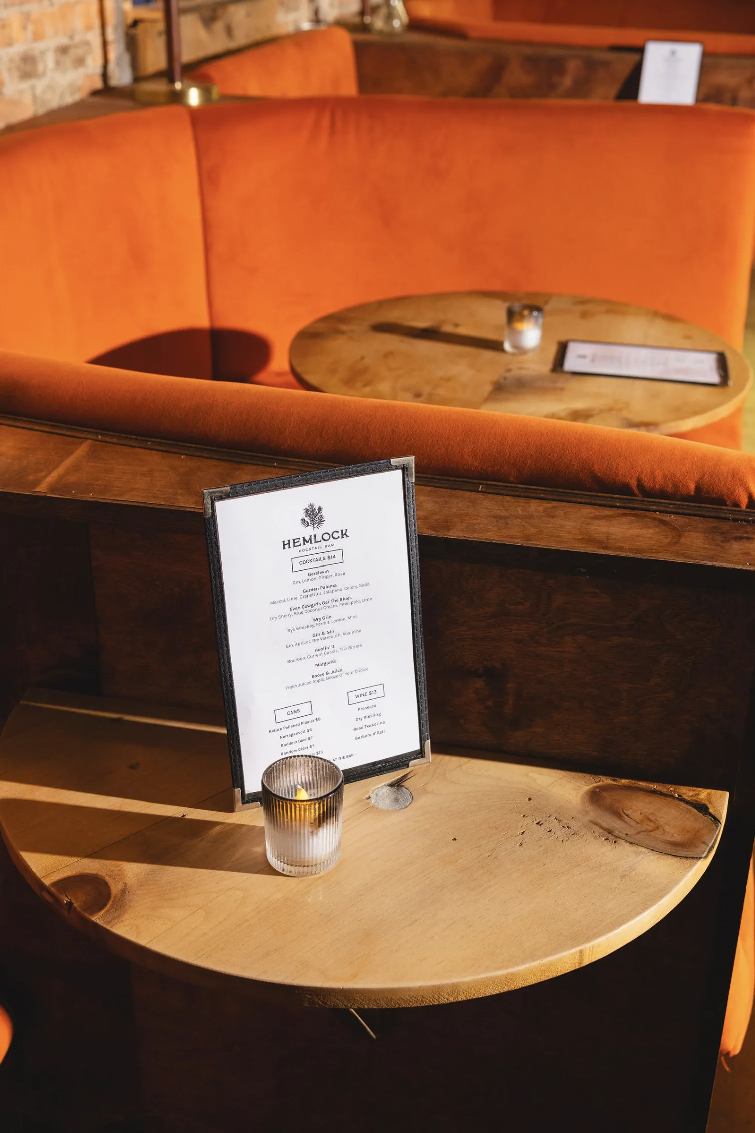
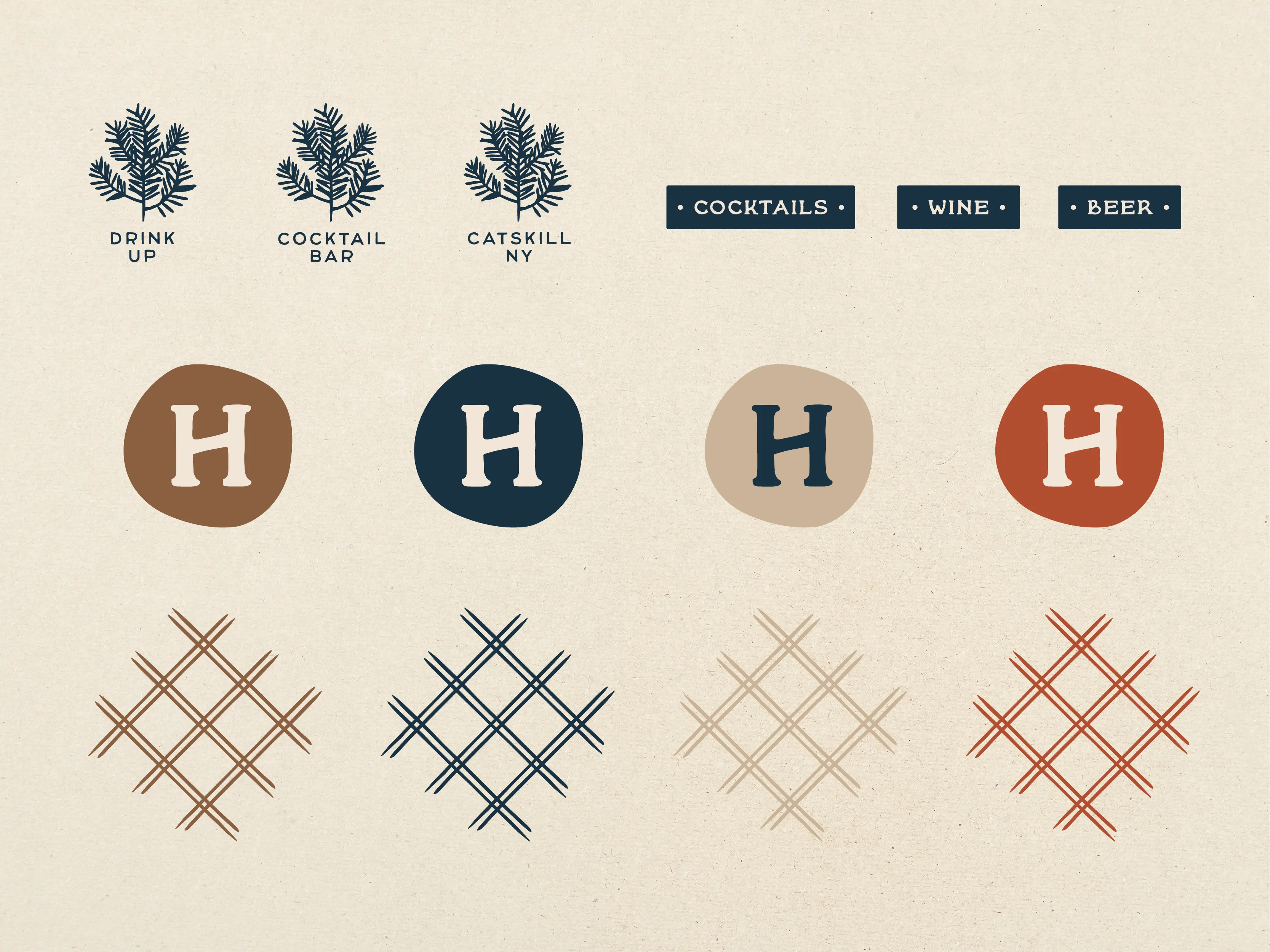
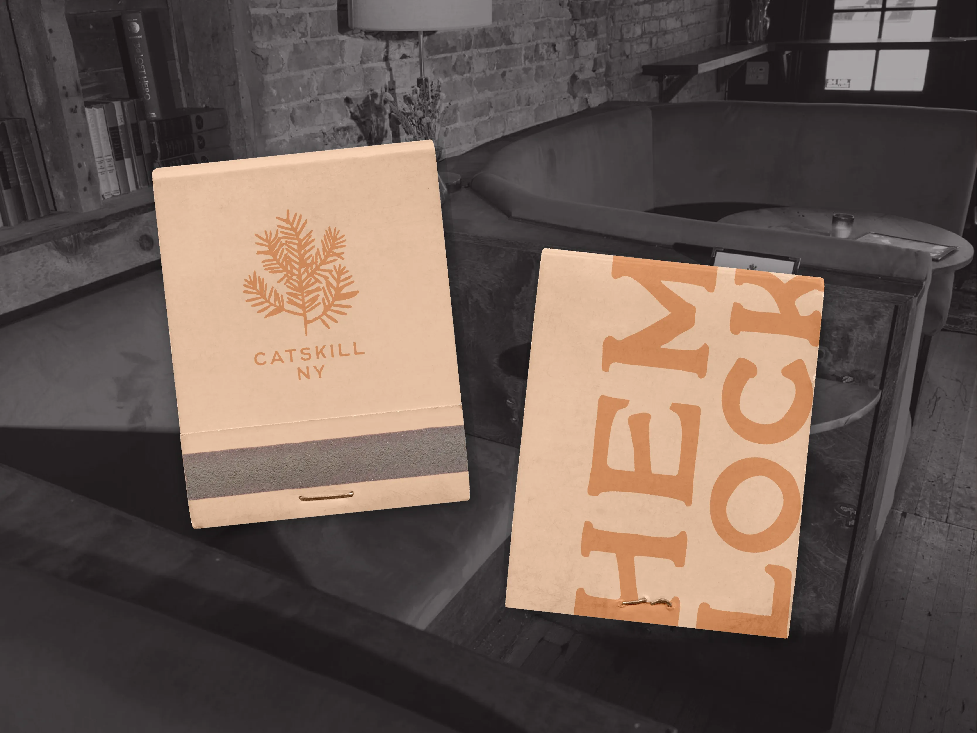
A Catskills cocktail bar founded by a hospitality veteran who knew exactly what the space should feel like—and needed the identity to match.
One year after opening, Hemlock was named one of Esquire's 15 Best Bars in America (2025).


Cavalli
BRAND STRATEGY, IDENTITY
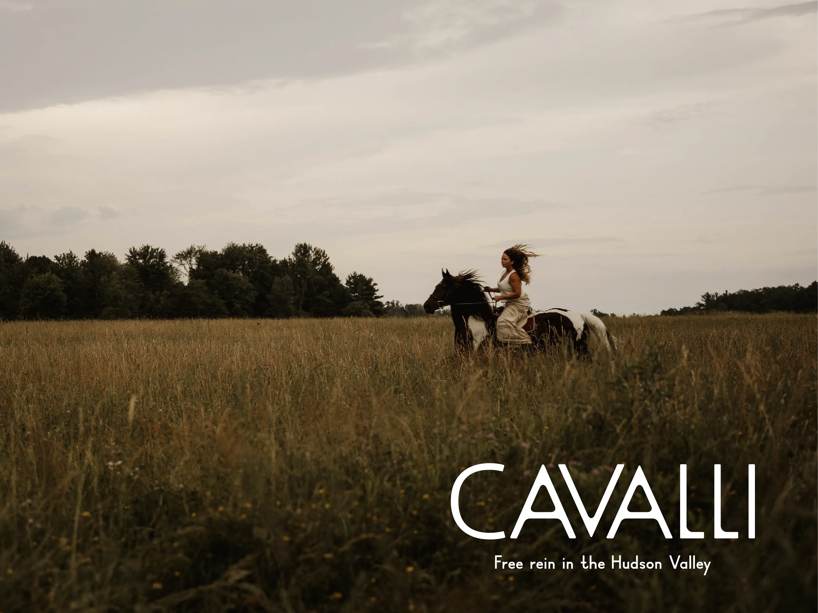
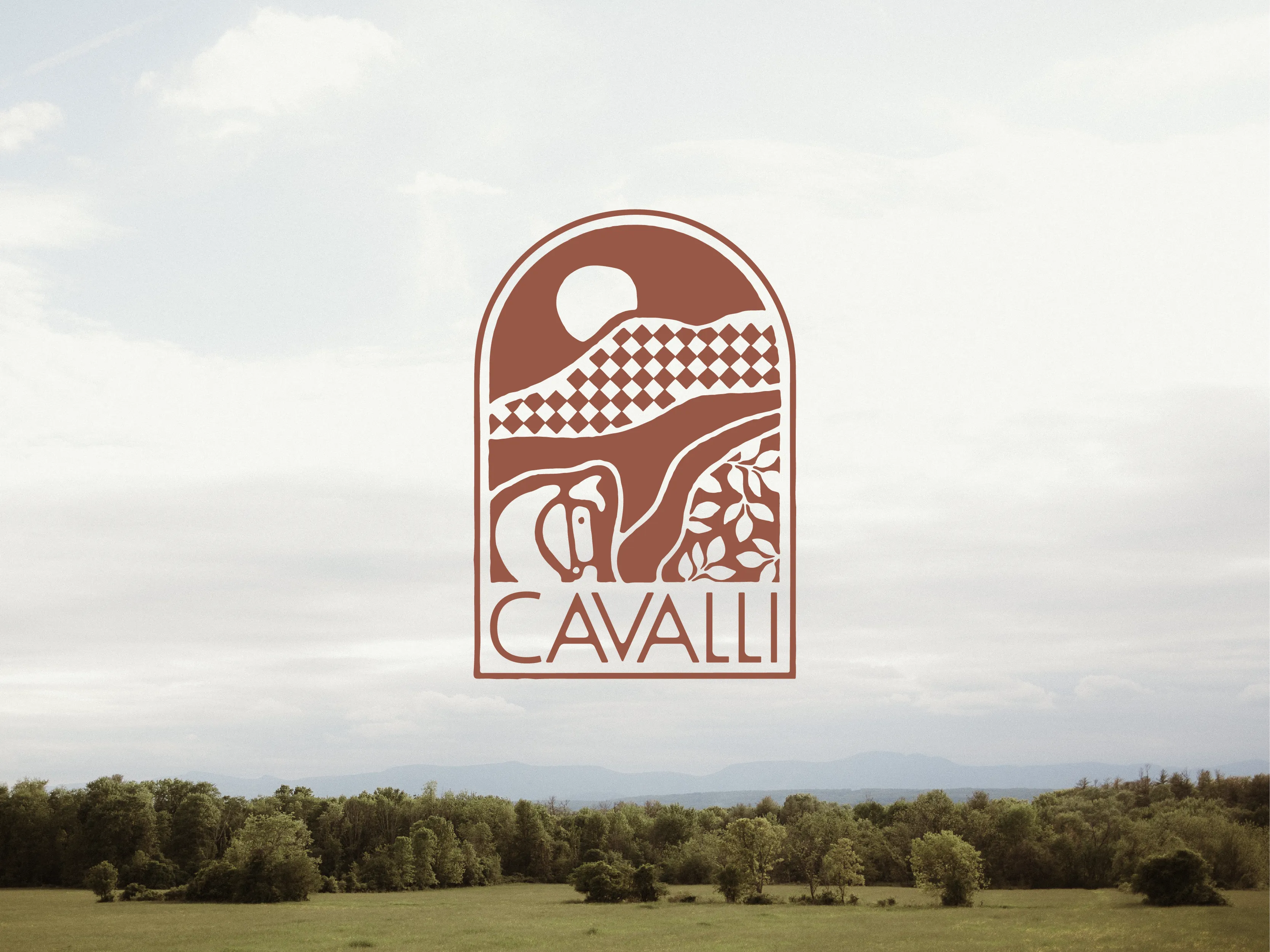
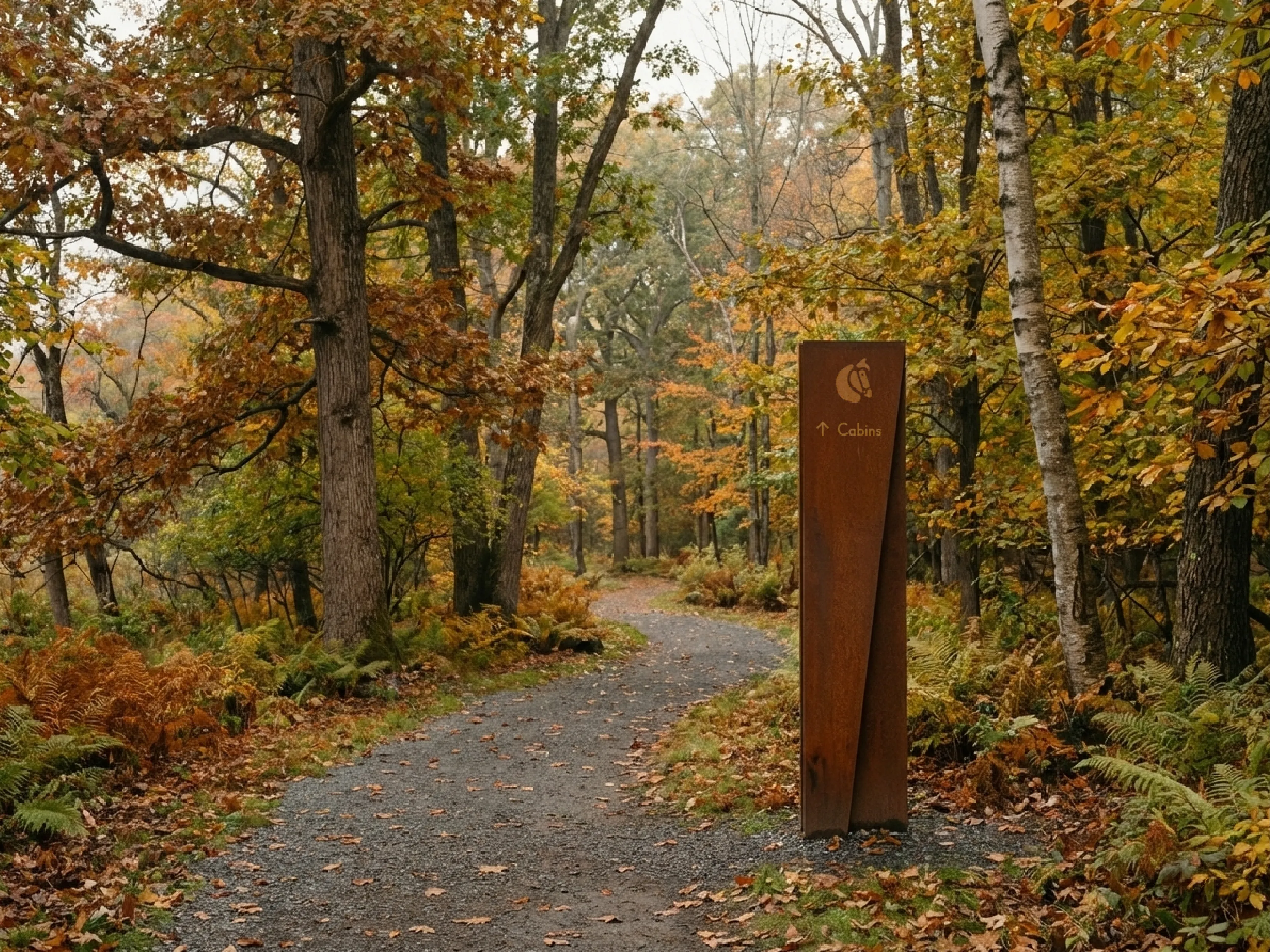
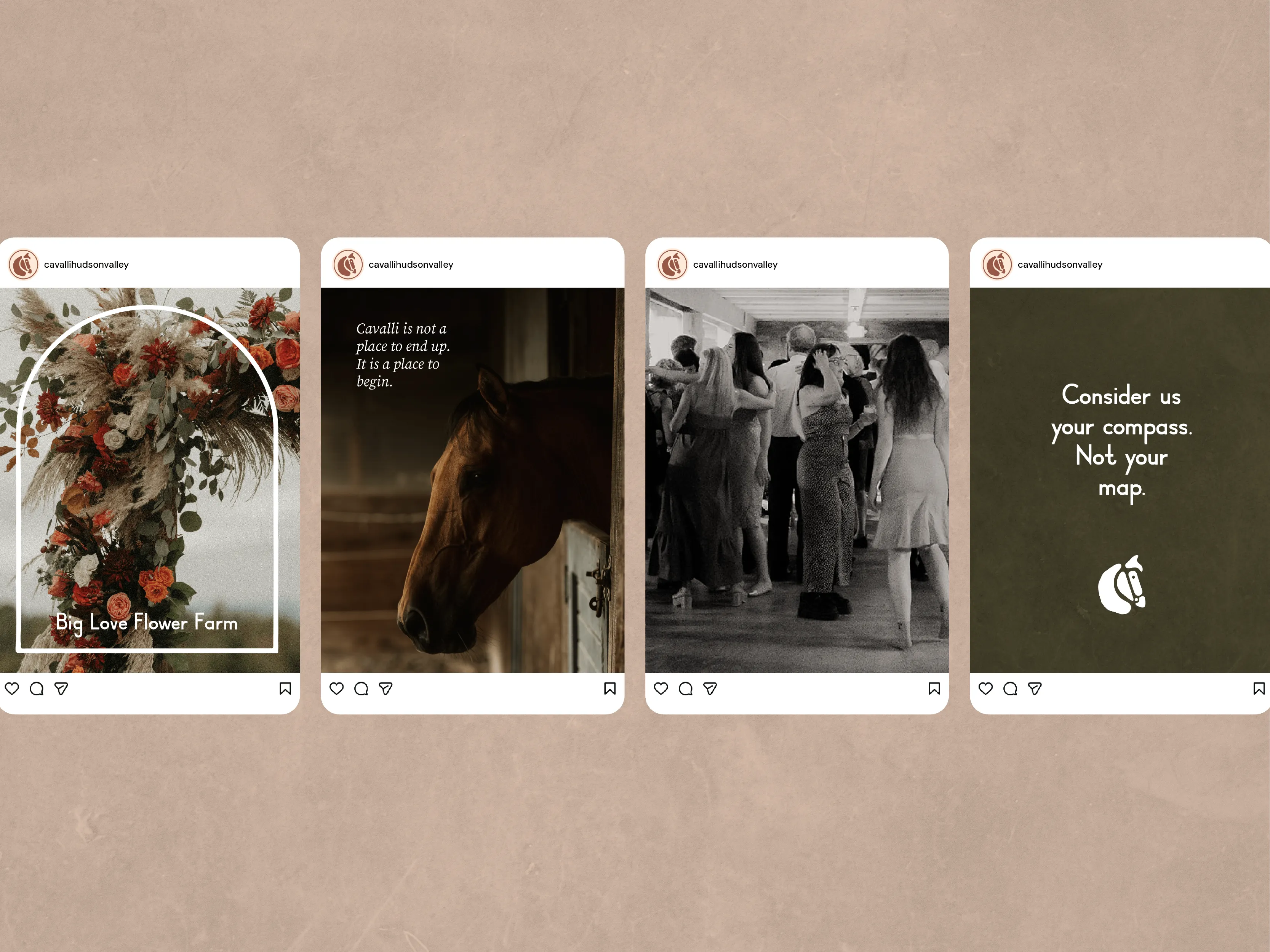
After three years under a different name and a narrower identity, Cavalli Hudson Valley relaunched as an upscale destination for weddings, events, programming, and onsite stays—with a broader lifestyle brand already taking shape.
One year after the rebrand, wedding revenue and average booking value are up, monthly inquiries have nearly doubled, and bookings are shifting into the venue’s higher-value tiers.


Palma Design
BRAND IDENTITY
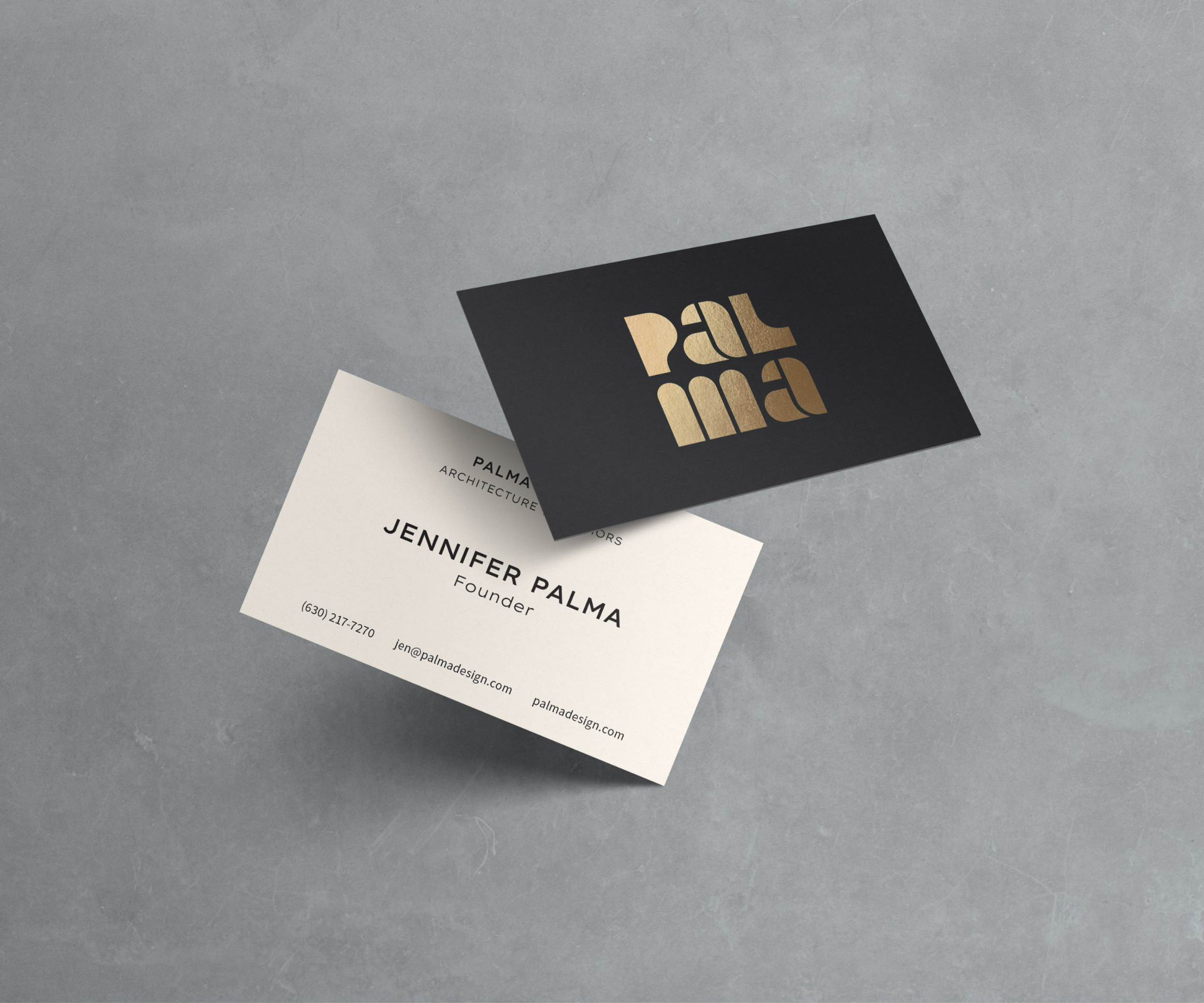
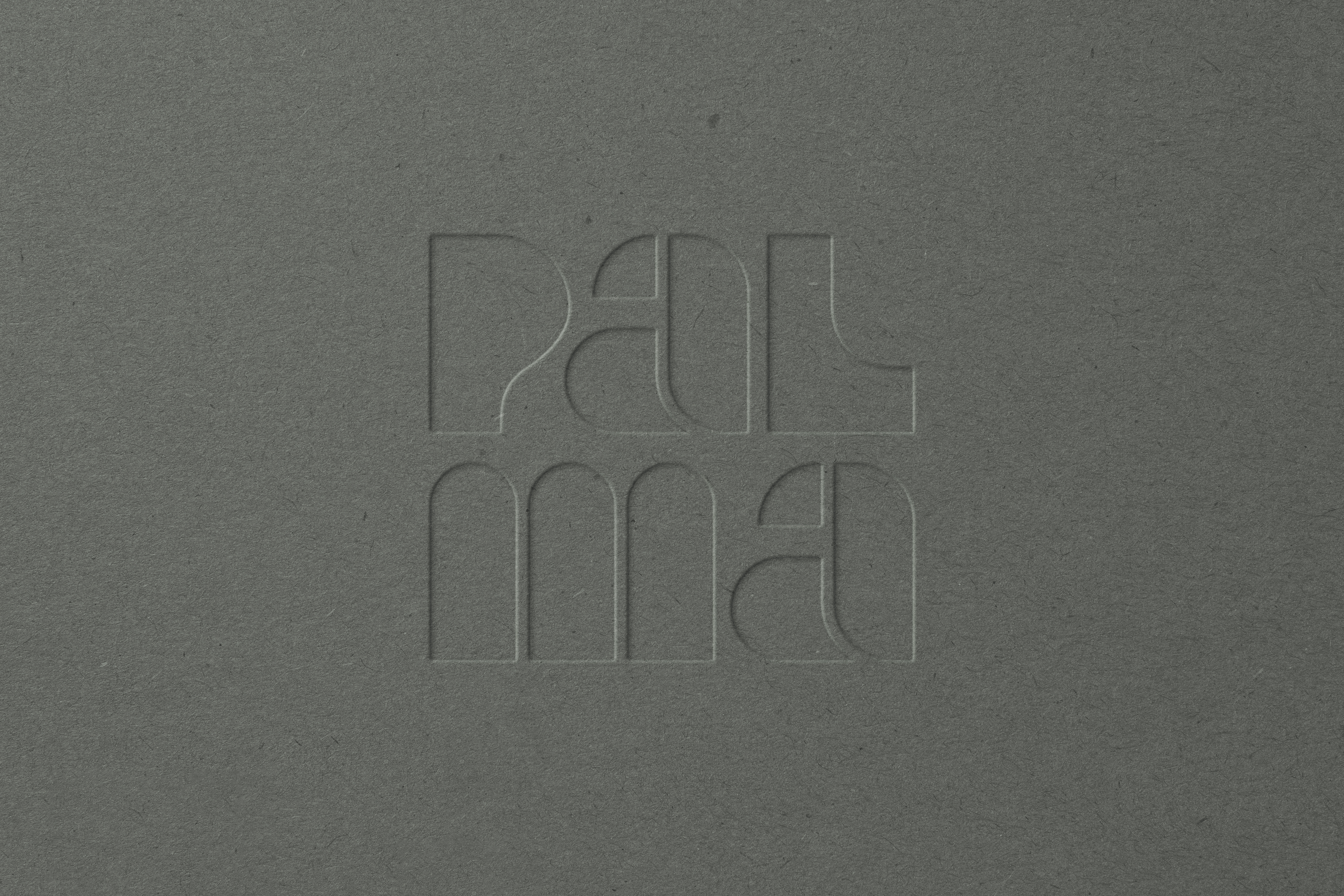
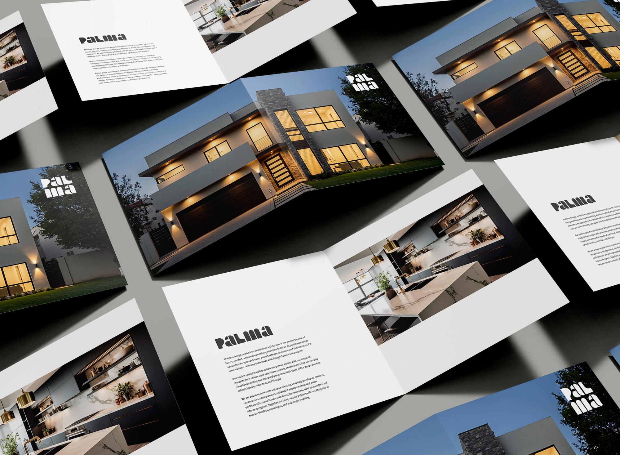
A clean, architectural identity that positions Palma Design as thoughtful, modern, and design-forward—giving the studio a strong foundation as it grows its portfolio and presence.
A visual identity with clean lines as far as the eye can see. Refined typography, neutral palette, and a system flexible enough to support both conceptual work and built projects. The goal was to create a brand that felt established without being overworked.






The Reed Street Bottle Shop
BRAND STRATEGY, IDENTITY
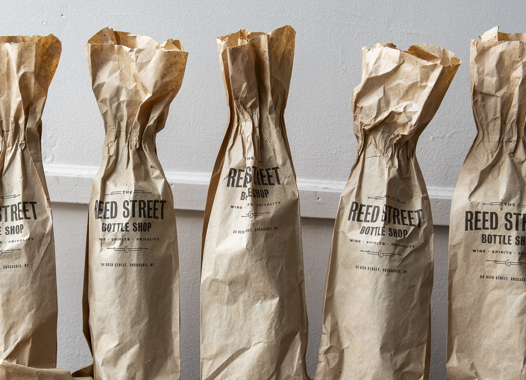
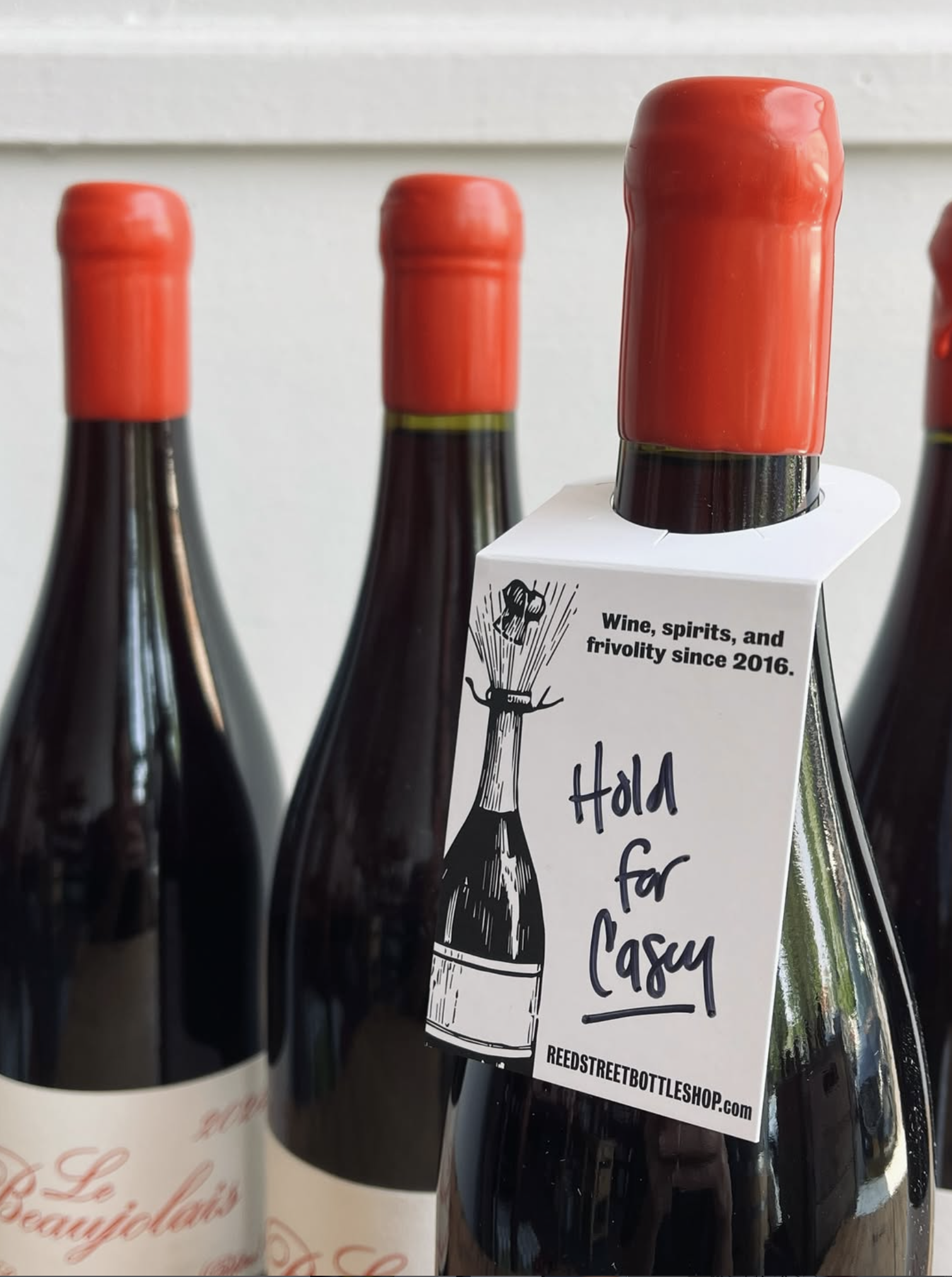
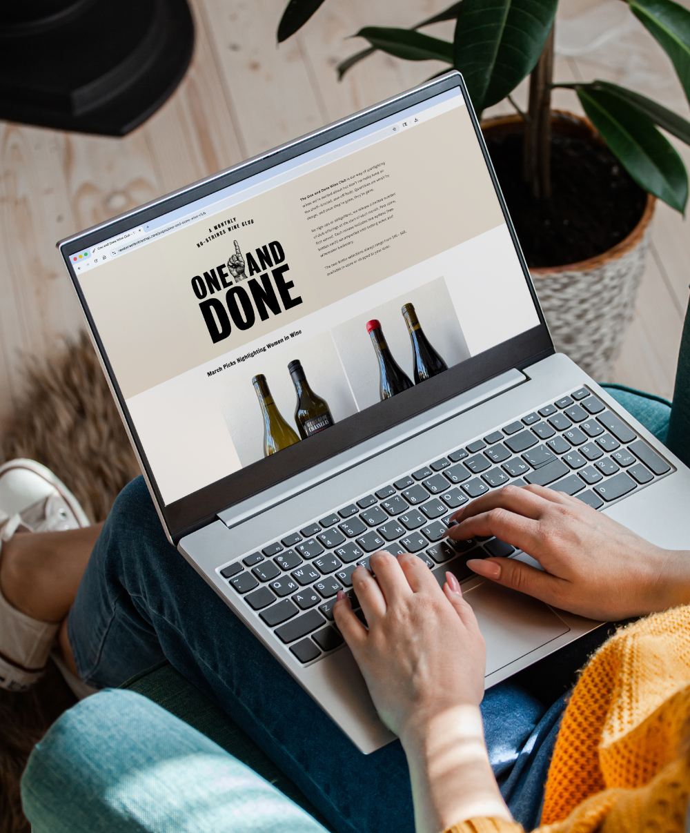
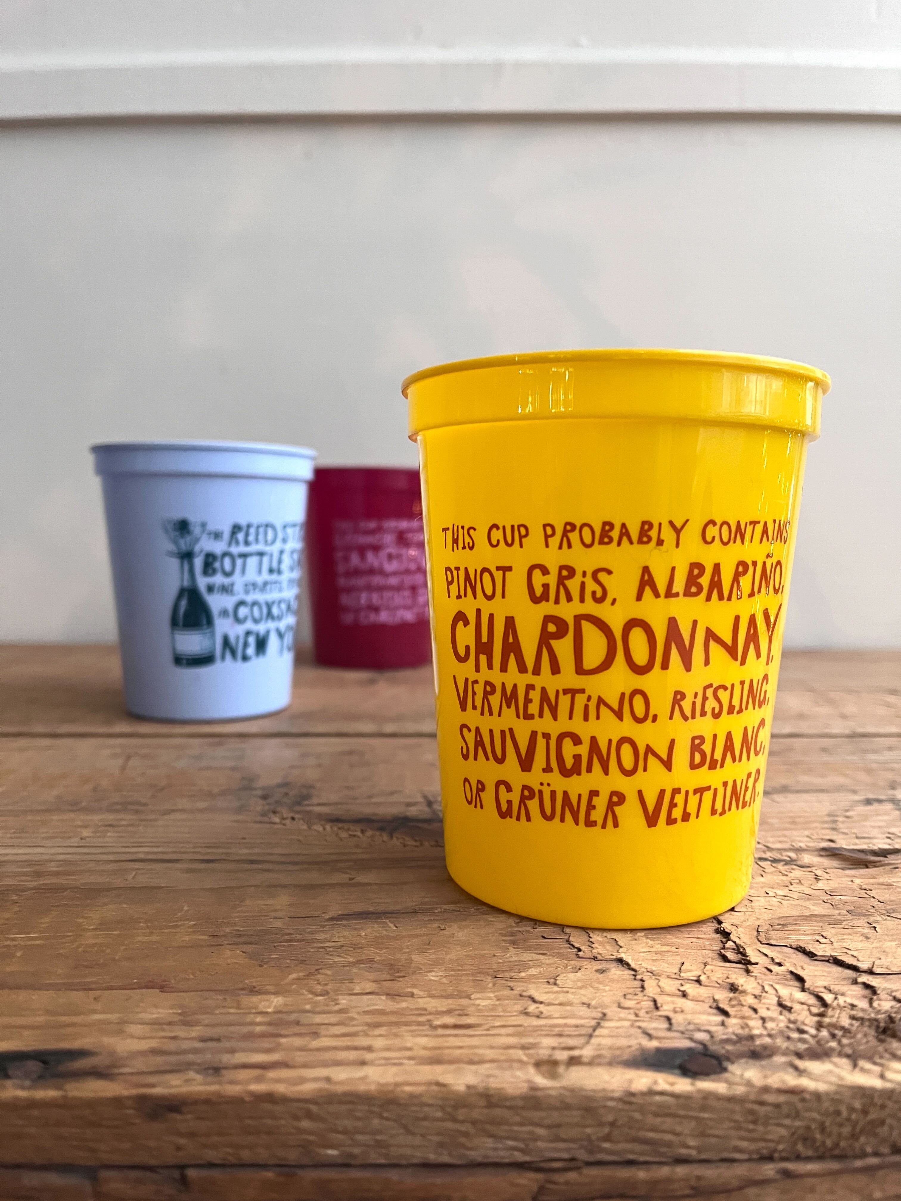
A wine store in a small Hudson River town, built on the belief that serious taste and zero pretension belong in the same room. Named one of the Hudson Valley’s best by Food & Wine.
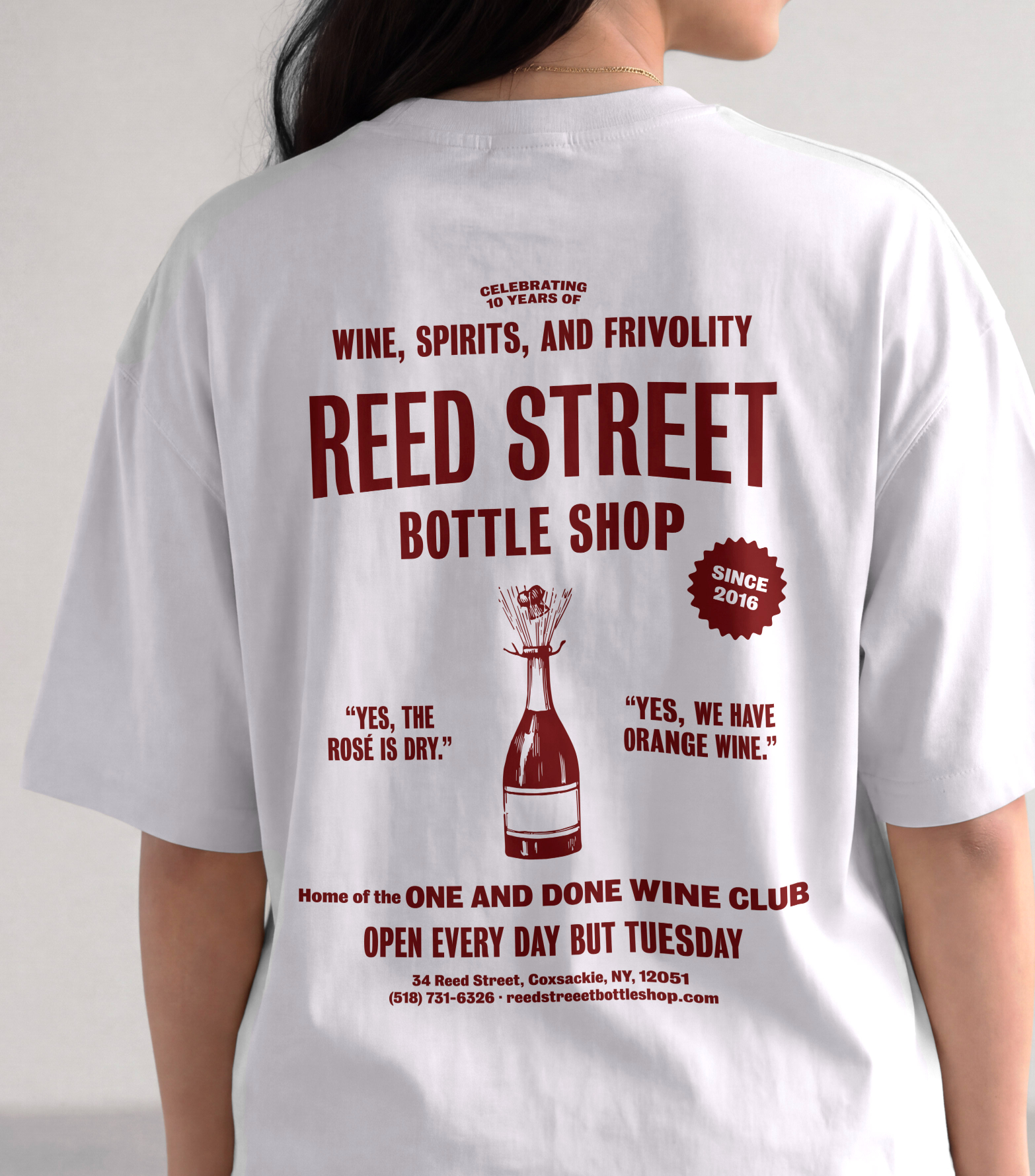
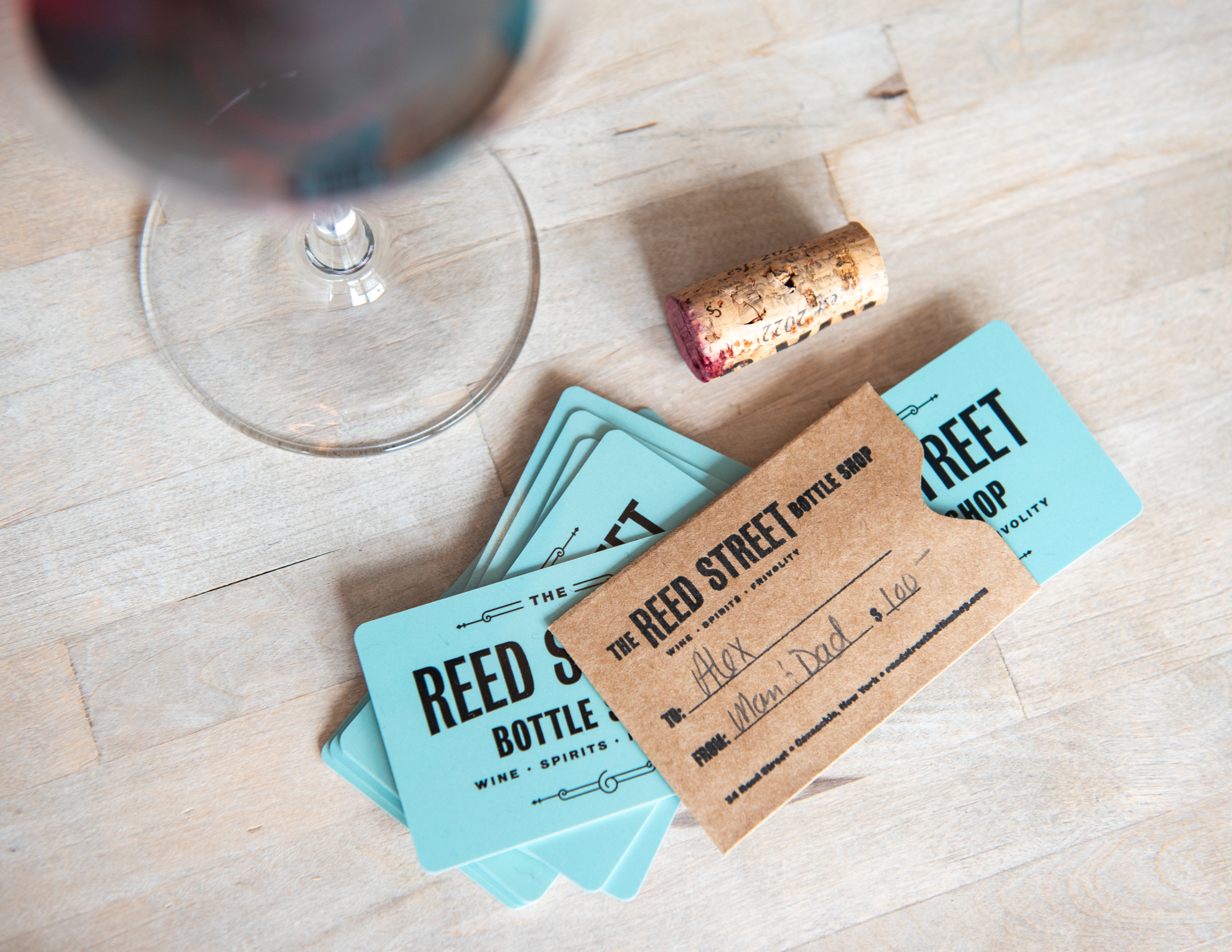
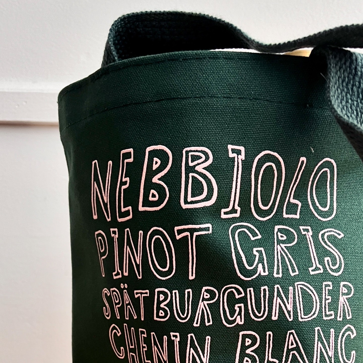
The identity is anchored in bold, historic typography that nods to the village storefront it lives in, with
a hand-drawn merch capsule for wit—carried across the bags, the shop, and a monthly wine club.
60%
increase in
average
booking value
140%
increase in wedding revenue
The work has to work.
A stronger brand builds a stronger business. Example: After three years under a different name and a narrower identity, Cavalli Hudson Valley was ready for a brand that reflected what the venue had become. Our rebrand brought the business in line with the elevated experience it was already delivering, helping attract more inquiries and higher-value bookings. Here’s what changed.
88%
increase in
monthly
inquiries
Jacqueline Alexander
Co-Founder, Cavalli Hudson Valley
Working with Susan was a game-changer for our brand. Her process is incredibly buttoned-up and driven from day one — she came in with sharp competitive analysis, a deep understanding of our space, and a clear strategic vision that shaped every decision for where Cavalli needed to go.


